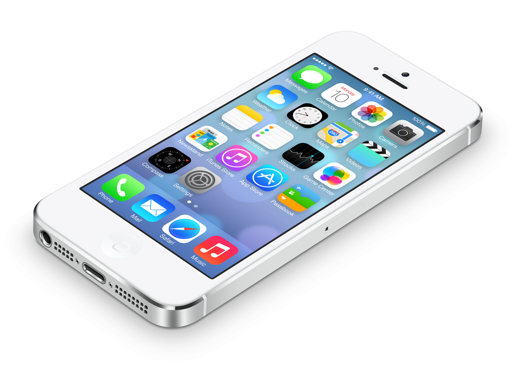
iOS 7′s Redesign
When the iPhone debuted, it set the standard for a lot of things, among them the GUI of a touch-based mobile operating systems. But that was in 2007, and the design of iOS has gotten a bit stale and heavy by today’s standards. Some even say that “iOS is the Windows XP for mobile devices” – its familiarity is loved by so many that it’s going to be hard for Apple to make radical changes. But yesterday, Apple did just that: it introduced iOS 7 which finally brings a clean redesign of the whole GUI, while keeping all the elements at their familiar places. So, is it any good?

I don’t care much for the new App icons, the rounded corner radius is too large and the Safari icon in particular is just gross. Also, the default home-screen image is reminiscent of some 70s bling, which turns especially awful when seen through a translucent panel; fortunately that image can be swapped out by the user.
But other than that, I like the redesign. It really shines in the Apps as well as the Notification and Control Centers: no visual clutter or heavy chrome, a smaller and crisper color palette, and carefully chosen whitespace and typography. The translucent navigation areas place them clearly on a layer above the content (when scrolling in Safari or playing a movie, they even slide unobtrusively out of sight). The Apps in turn are above the background image, on which the parallax effect is used to form a sort of three dimensional box to peek into.
The new design is not “flat” (whatever that means), but it’s streamlined. And while removing visual clutter always comes at the risk of harming discoverability, I think iOS 7 didn’t go too far. Buttons may be gone, but the interaction elements are at the familiar consistent places and if it’s blue text (or in some Apps red, but always looks like a link) or a wireframe icon, the user knows it’s save to tab.
Everyone should choose a better home-screen image, Apple fix the icons, and then iOS 7 is a solid foundation to improve upon.

