Marcel Wanders between Art and Design
After walking through yet another museum’s collection of the internationally established canon of modern art, I was amazed to discover a temporary exhibition that felt so immediate and contemporary: “Marcel Wanders: Pinned Up At The Stedelijk, 25 Years of Design”
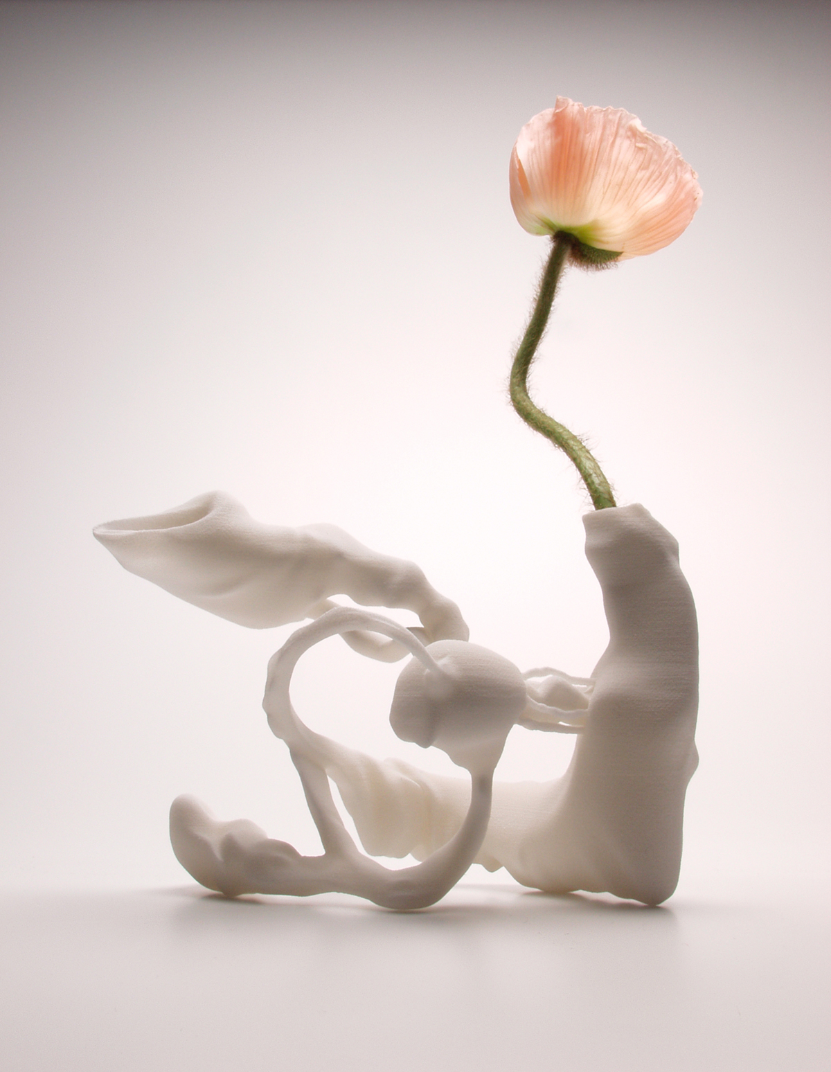
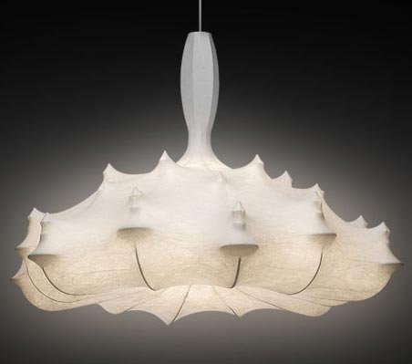
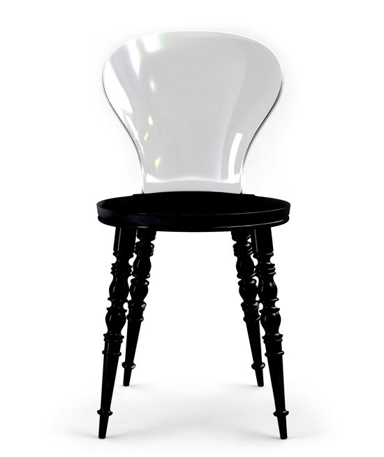
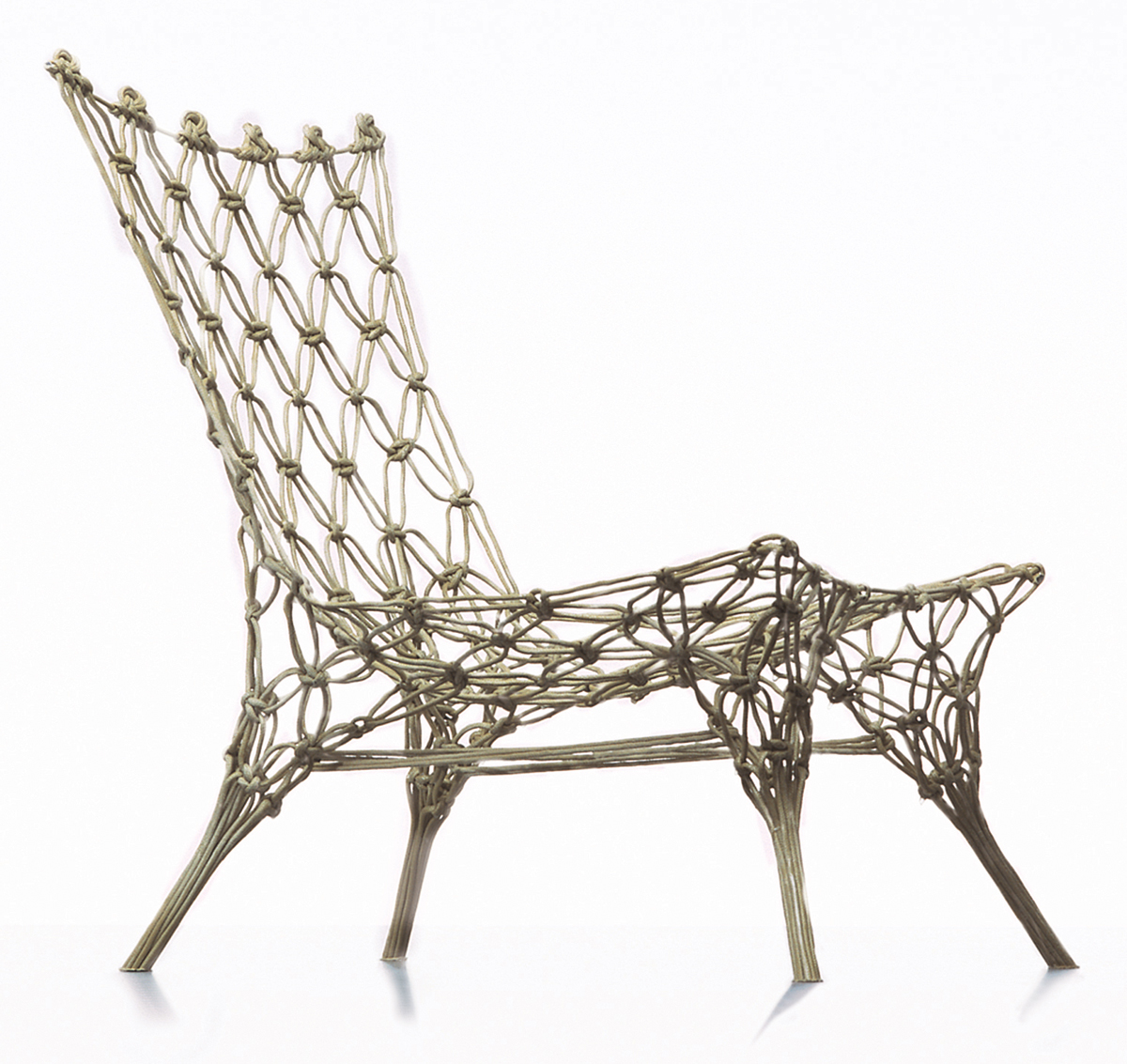
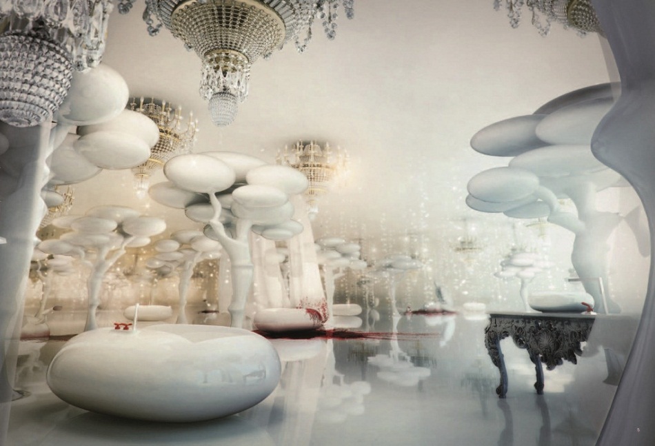
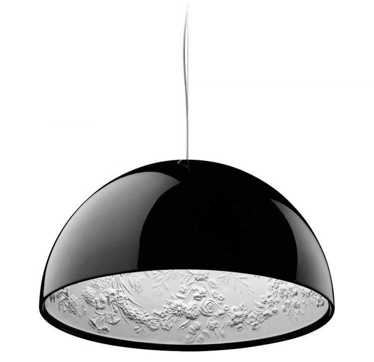
I wouldn’t say Marcel Wanders’s creations are characterized by beauty. Sometimes they are beautiful, sometimes I find them quite hideous. Sometimes both at the same time. The most consistent quality I find in his work is that it makes me laugh or smile. An unexpected change of scale, a surprising combination of patterns, shapes and materials, and no fear of having to conform to any classical notion of beauty. Although often, his creations are reflections of historical or organic shapes.
As a piece of art, interpreted as a critique of society’s lack of vision around the millennium, I love his work. But to actually spend any significant amount of time in one of his interiors? No. Hell no.
But maybe Marcel Wanders is in fact sincere with his products and tries to give non-designers a version of design that they again can relate to.
A product must feel familiar. This is why he chooses elements that everyone recognizes because, for instance, they are based on historical sources of inspiration.
—2014 Stedelijk exhibition
That may be his personal vision. To sidestep the problem of the late 1990s and the first decade of the 20th century’s lack of a shared vision.
Does the concept of future still exist in a culture in which a coherent vision has disappeared?
—Marcel Wanders
Sometimes, the result feels like a “Best of IKEA”. It’s good design, no doubt about that. But for my taste, it’s often too much “bling bling”—too cheap and too extravagant at the same time. As a child of modernity, I’m still waiting for the good old future.
